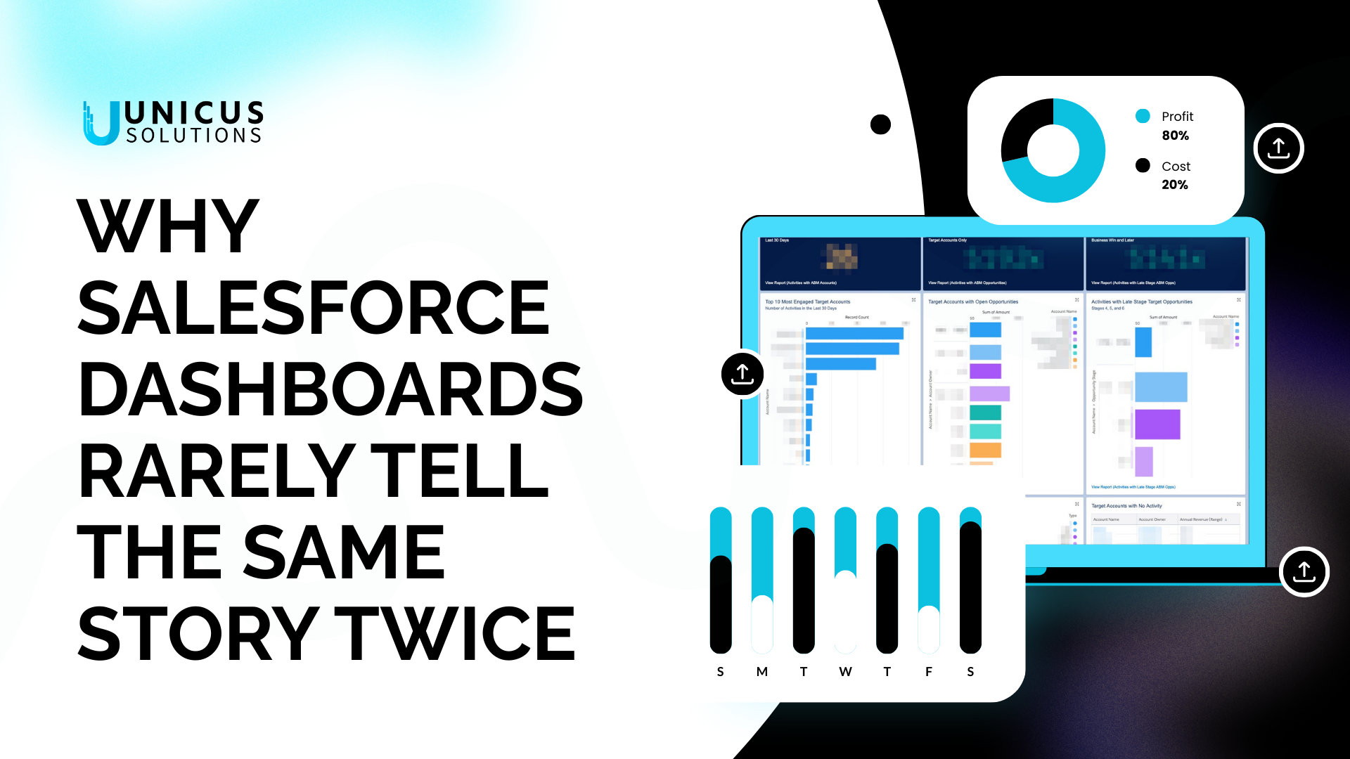
Most leadership teams rely on Salesforce dashboards to understand what’s happening in the business.
Pipeline. Forecasts. Performance.
And yet, one of the most common things we hear is:
“Everyone has a different number.”
If that sounds familiar, you’re not alone.
When Dashboards Create Debate Instead of Clarity
Salesforce dashboards are powerful — but only when the system behind them is consistent.
When they’re not, dashboards tend to expose problems rather than solve them.
We often see situations where:
- The same metric is defined differently across teams
- Reports rely on workarounds and hidden filters
- Data is technically correct, but practically misleading
So meetings turn into debates about whose dashboard is right.
Why This Happens More Than Teams Expect
Dashboard issues are rarely a reporting problem.
They usually trace back to:
- Inconsistent data capture
- Processes that evolved without alignment
- Automation that updates records in unexpected ways
In other words, dashboards are showing you exactly what the system is — not what you hoped it was.
How Unicus Approaches Dashboards Differently
At Unicus, we don’t start dashboard work by opening the report builder.
We start by asking:
- What decisions does this dashboard need to support?
- Who needs to trust it?
- What assumptions are baked into the data?
Only then do we design:
- Clear metric definitions
- Data models that support reporting
- Dashboards that answer real questions, not just display charts
What Changes When Dashboards Work
When dashboards are built on solid foundations, teams notice that:
- Meetings move faster
- Decisions feel easier
- Confidence in Salesforce increases
Dashboards stop being something you explain — and start being something you use.
Final Thought
If your Salesforce dashboards don’t agree, the issue usually isn’t the dashboard.
It’s the system underneath.
Fixing that is where Unicus focuses.